


Search by your postcode to see your local situation.
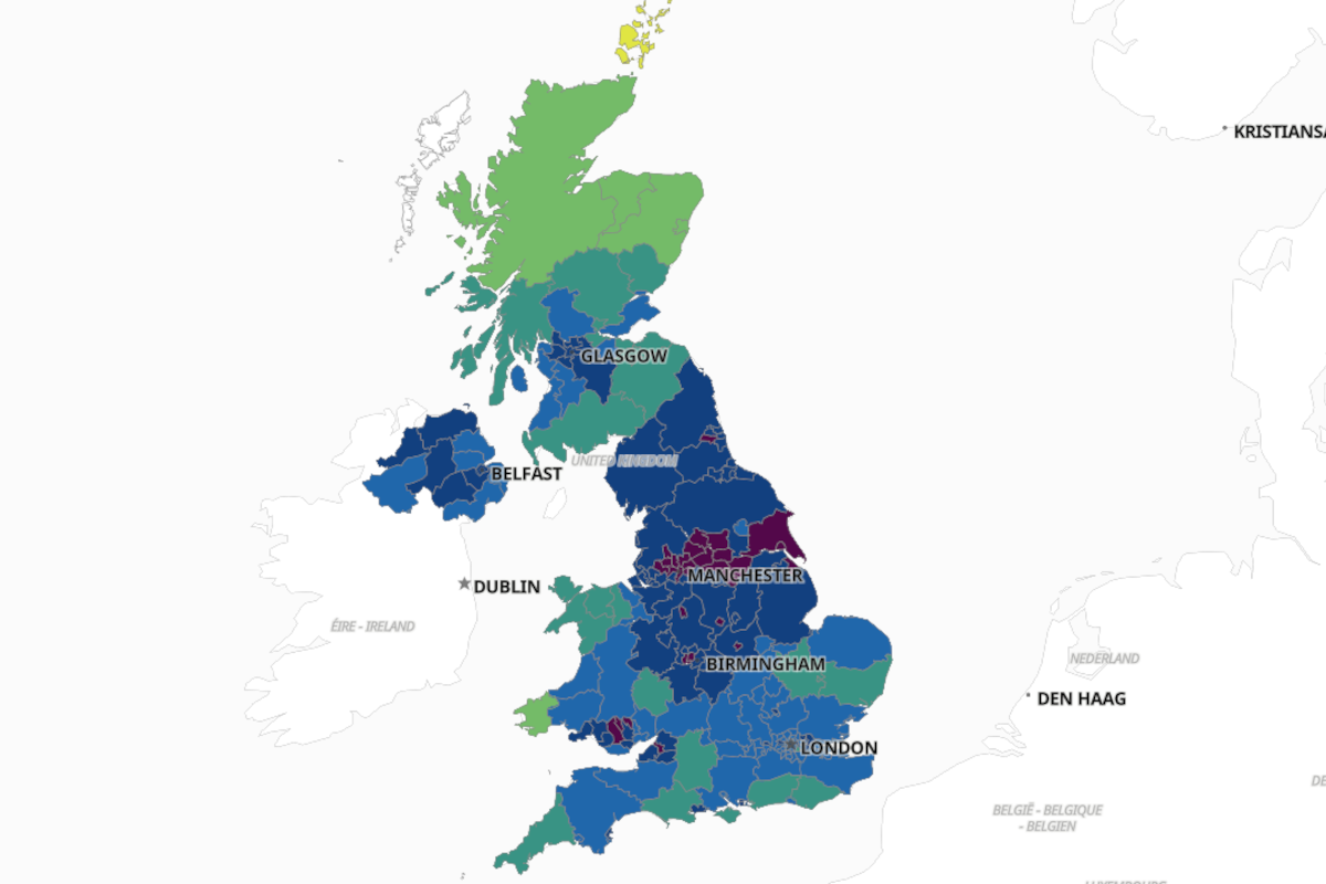
As the COVID Infection rate in the Scarborough Borough hits twice the national average an interactive map shows just where the hot spots are.
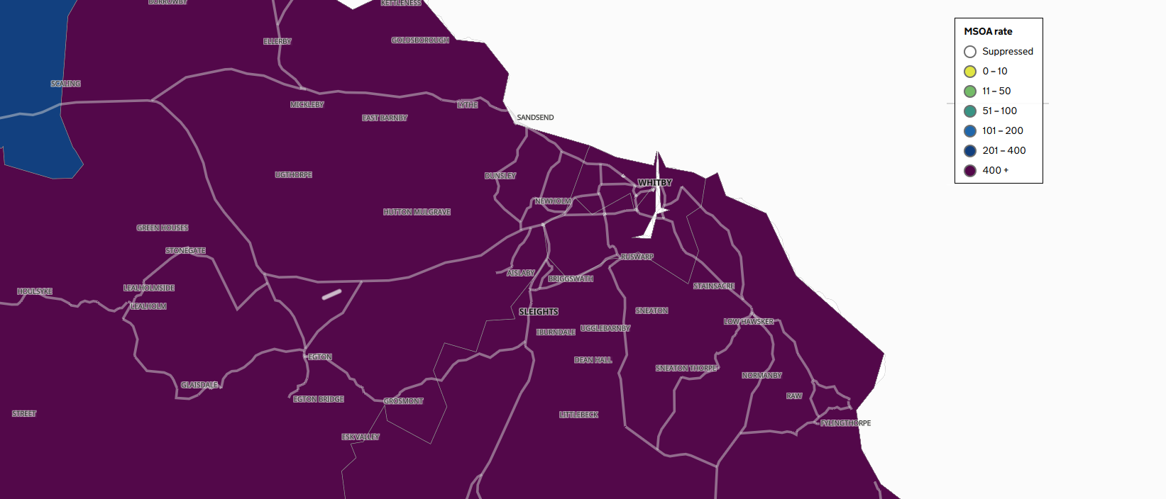
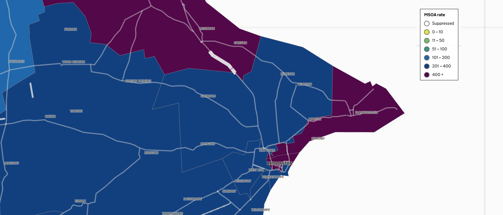
The map shows the seven day infection rates for different areas of the country. The seven–day rates are expressed per 100,000 population and are calculated by dividing the seven day count by the area population and multiplying by 100,000.
The map uses data from a number of reporting authorities. On an initial glance the map shows the data from Upper Tier Local Authorities (UTLA). This shows the entire Yorkshire Coast has being in the highest category of infection rate.
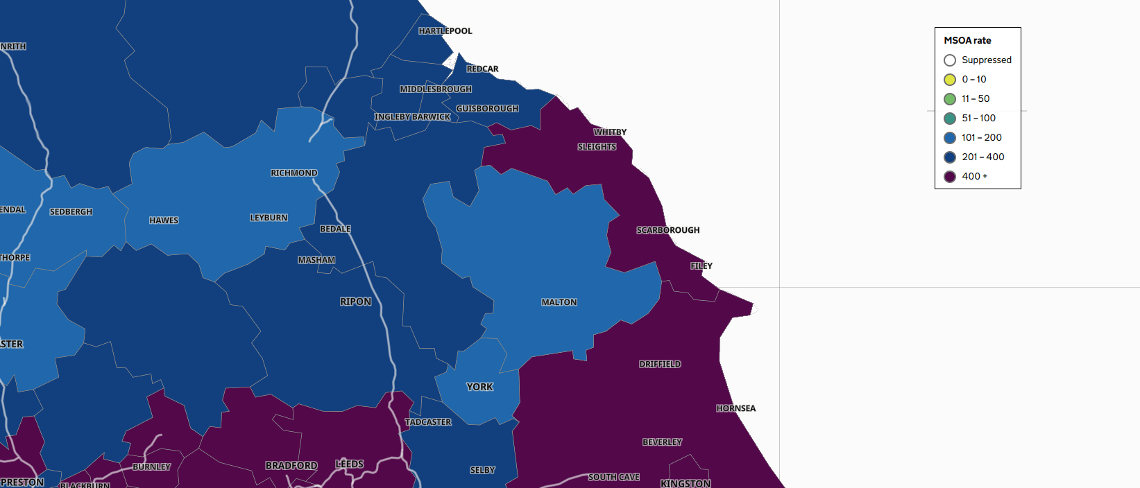
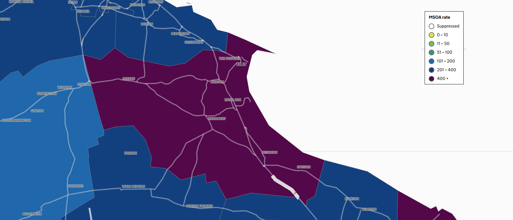
Bust as you zoom in to the map, more details emerge based on data from Lower Tier Local Authorities (LTLA) and Middle layer Super Output Areas (MSOA).
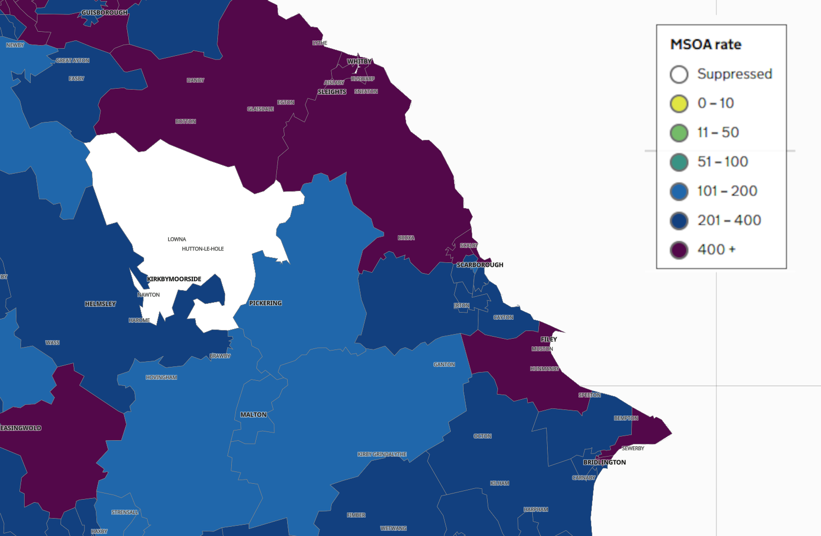
This begins to show the data in a more localised way and highlights where along the Yorkshire Coast the highest infection rates are being seen.
SCARBOROUGH

FILEY
WHITBY
BRIDLINGTON
The maps are being updated on a daily basis and you can scroll back through the data to see how the spread has changed overtime.
It's also possible to search the map by Postcode to see the situation where you live.

 Eastfield Medical Team Finds a Home Closer to Patients Following Flood Chaos
 Whitby Heritage Lifeboat to Offer Lifeline to Disadvantaged Children
 Expert Support for Scarborough’s Bid to be ‘Town of Culture’ and Secure £3.5m Prize
 Scarborough Land Train Proposal Gets Enthusiastic Support from Council
 BT ‘Street Hubs’ Proposed for Scarborough
 Christmas Community Dinners Planned for Scarborough and Eastfield
 Scarborough Fire Station to be Prioritised for Major Redevelopment in New Fire Service Plan
 Scarborough and Whitby Fake Dolls Seizure Prompts Safety Warning as Christmas Nears
 Filey MP Expresses Disappointment at Lack of Wildfire Support for Farmers
 Scarborough and Whitby MP Thanks Moorland Wildfire Heroes
 Eastfield Community Groups Given 15-Month Deadline to Secure £3.2 Million Investment
 North Yorkshire Moors Railway Steams Ahead with New YouTube Channel